
Created on 99designs by Vista
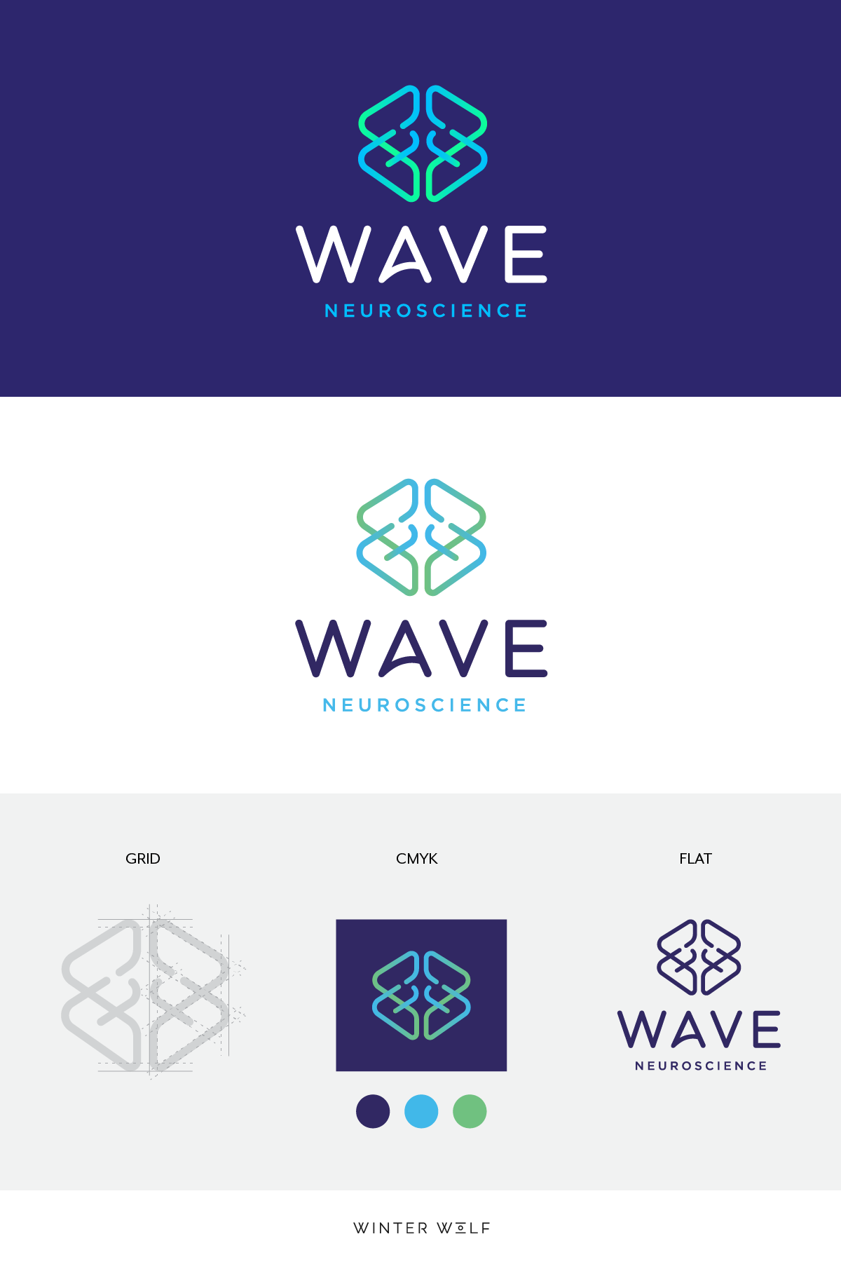
• This logo was created using a grid – indicating precision, calculations and logic, which compliments the brand values.
• The icon features two 'W's reflected to symbolise a brain.
• The interconnectivity also reiterates brain signals and waves
• The overlapping gradient represents movement.
• The stroke widths of the icon compliment the weight of the typeface.
• The smaller type for ‘neuroscience’ creates an aesthetic balance.
• The logo can come in a bright RGB for web-use or can always be portrayed in CMYK (print colours).