
Created on 99designs by Vista
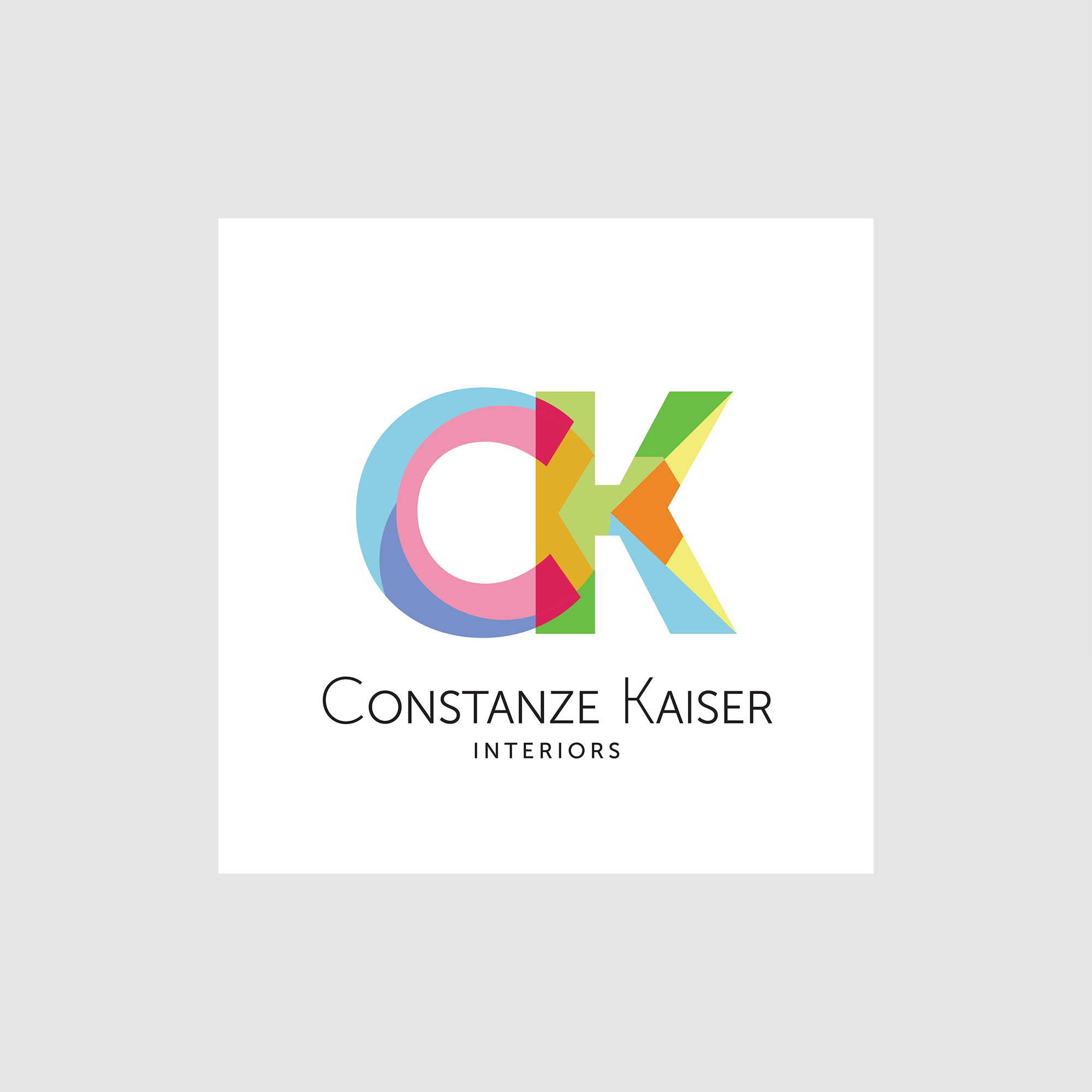
I wanted to bring a lot of color, symmetrical & asymmetrical elements together; this is akin to the responsibility given to an interior designer: having to pull together so many different choices and elements and still finding a way to bring them all together to achieve harmony.
Hopefully, I conveyed "playful yet reserved", which I believe is a philosophy used by interior designers.
The Museo typeface for the company name ties it all together and anchors the colorful mark with a quiet tone. It is also the base typeface for the mark.
The logo will also work in black and white outlines (not shown here) for print materials.