
Created on 99designs by Vista
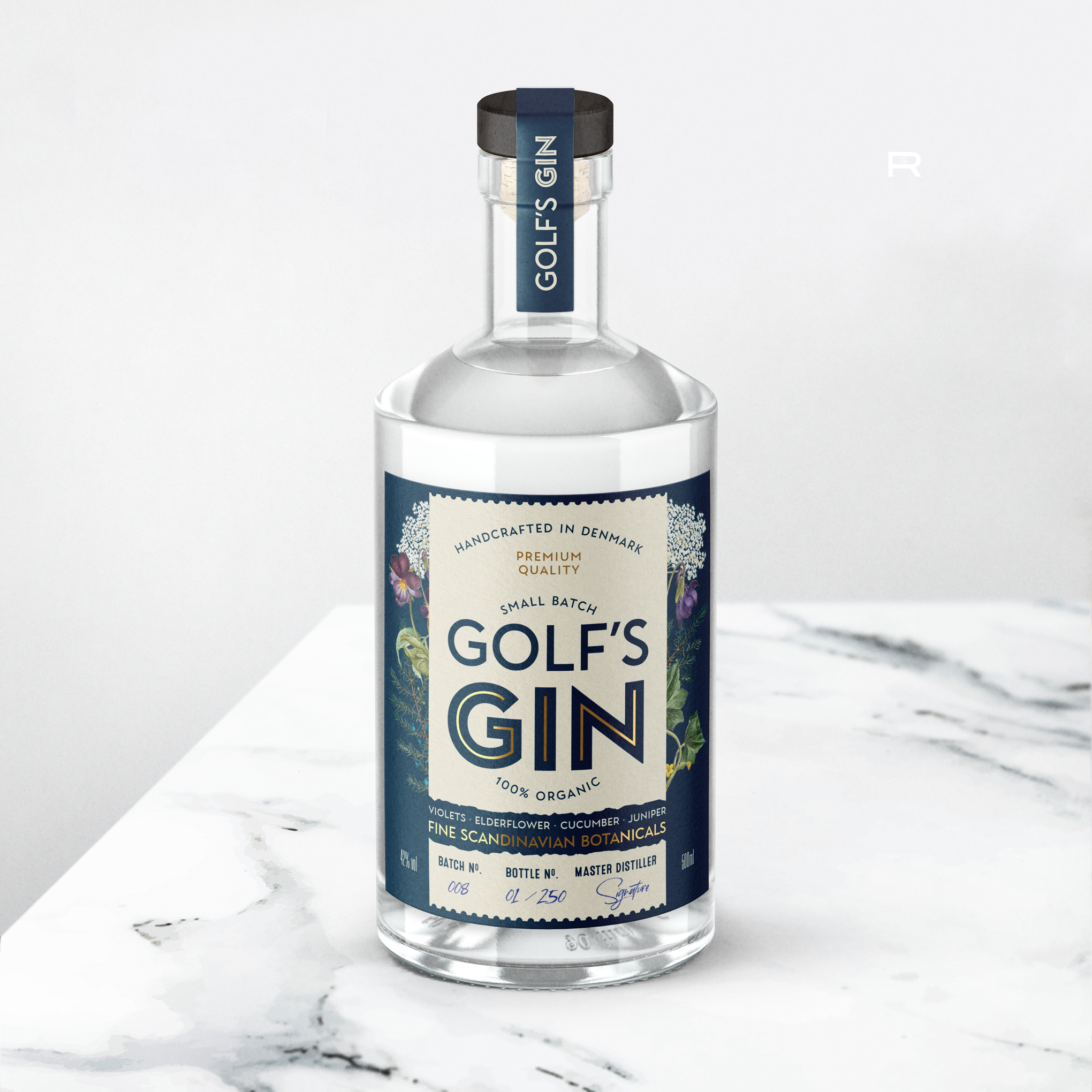
I worked towards a modern organic style. Nice vintage illustrations of flowers and plants from the ingredients make a subtle focal point, while adding colors, interest and a sense of tradition. The main product name makes a bold element to start reading the bottle. For the product name I chose a font that is elegant yet simple, to convey a sense of “maturity”.
Gold foil accents enhance the premium vibes for this product’s label.