
Created on 99designs by Vista
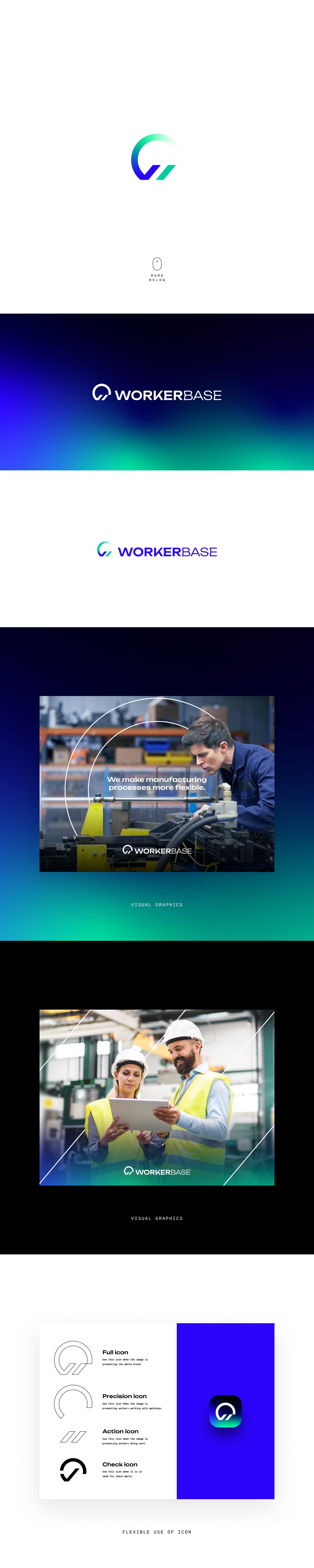
I have tried to go into a different approach for "W." I have tried to combine the "W" and the "input/output" icons in an "abstract" way, so that it may NOT look like "W."
I wanted the logo to represent these three things:
1. Input = data
2. Output = action or motion
3. Precision = manufacturing process
Upon exploration, I wanted to have a visual approach that is sophisticated, clever, and has a fresh look to it. In that case, since I have followed that approach, I have achieved a brand that looks trustworthy, different, and flexible.
I have provided some visual representations for you to get an idea of what I wanted the brand to achieve.