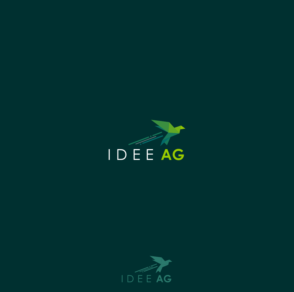
Logo concept for startup help factory
1
Created on 99designs by Vista
This was a very interesting project and I was a delight to work with the client. Origami is a an art where you have to use your imagination and this is how ideas are born. The bird symbolises freedom and perspective so is in close connection with the concept of the "idea" that was the main element for the logo. First I went for a green palette which symbolises renewal and energy but then I thought a black and white design would look more professional and bold and would have a greater impact on the eye.
