The Garden Berry – Hand-Illustrated Branding & Label Design

75
Created on 99designs by Vista
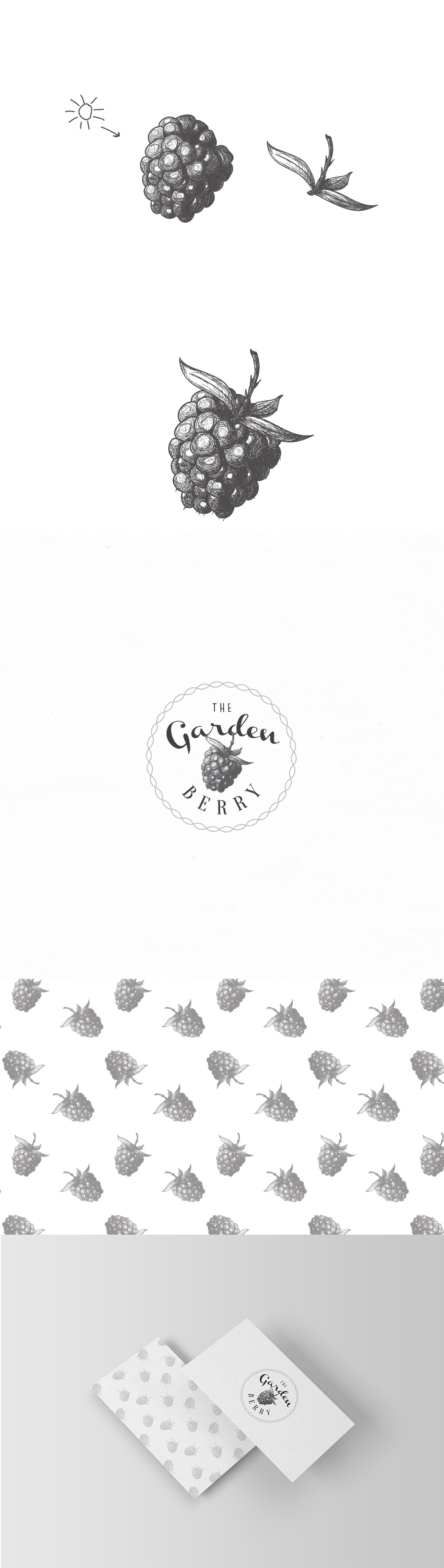
Inspired by botanical sketches and vintage produce labels, the design uses fine ink-style drawings to create an authentic, farm-to-table vibe. Each berry illustration was custom-drawn to capture the natural detail and charm of garden-picked fruit.
The logo combines a hand-lettered style with a round badge format, giving the brand a personal and homemade character. The circle shape also adds balance and a seal-like quality, ideal for labeling jars, packaging, or small-batch products.
A repeating blackberry pattern enhances the visual branding and can be used across print and digital materials. On business cards and other stationery, the minimal design lets the artwork shine while keeping the overall look clean, tasteful, and professional.