
This company is a wholesaler of tourist ancillary services in Italy. Trust is one of the most important values for the company. Their main purpose is maintaining a one-to-one approach with clients. It is important for them to be recognized as friendly and available to their customers, always open to any request. The tone must be professional, not excessively personal and always sober, since they deal with travel professionals from all over the world. Despite this, they didn't want to create an excessively formal image.
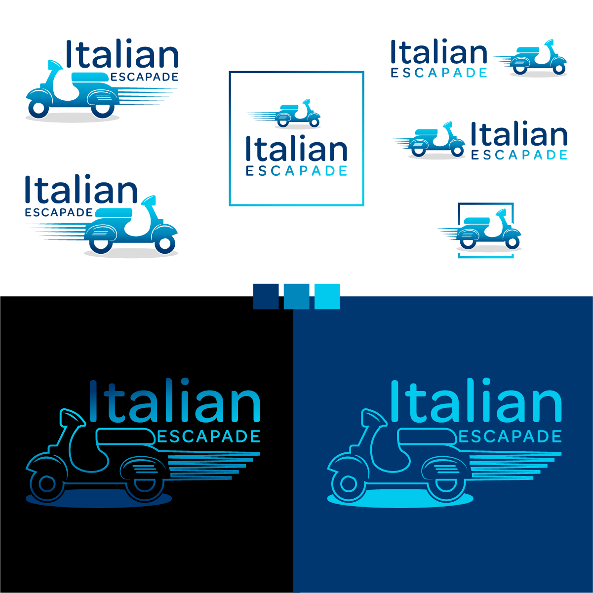
After doing research and learning about the wide use of vespas in Italy, this became the icon, symbolizing travel, exploration. The font is round, keeping it friendly and professional at the same time. All variations were provided to the client as they can each be used for differing circumstances.