
Created on 99designs by Vista
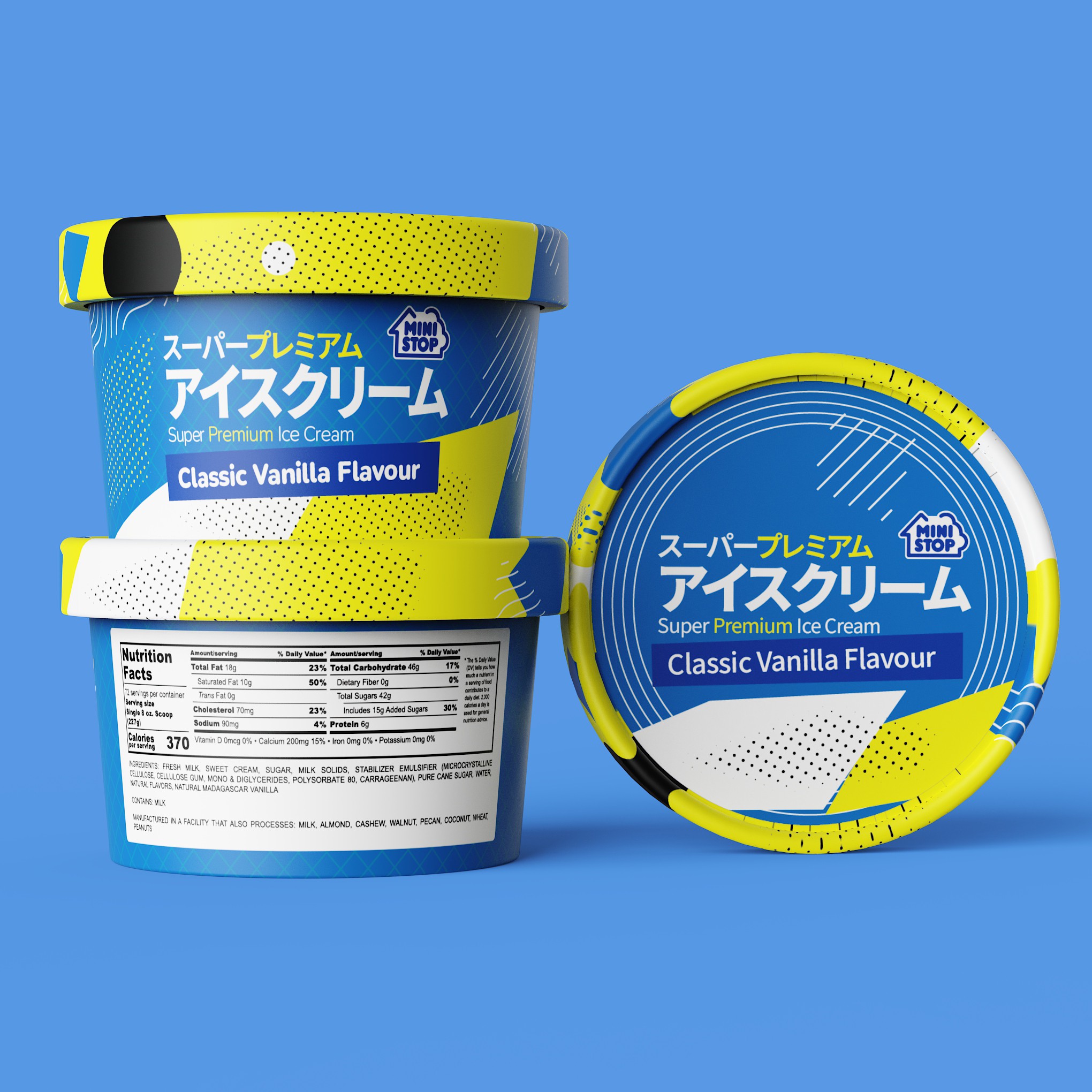
My design for Mini Stop X Secret Creamery’s Super Premium Ice Cream is a bold fusion of premium quality and modern playfulness. I’ve brought Japanese pop-art energy to the frozen aisle with a vibrant blue (#0a62ad) and yellow (#fff200) palette, dynamic patterns, and striking typography.
This packaging grabs attention while maintaining a refined appeal, and the adaptable, text-driven design ensures seamless integration across flavors, reinforcing brand consistency and recognition. It’s a perfect balance of fun and sophistication—just like the ice cream inside!
Looking forward to your thoughts!