
Created on 99designs by Vista
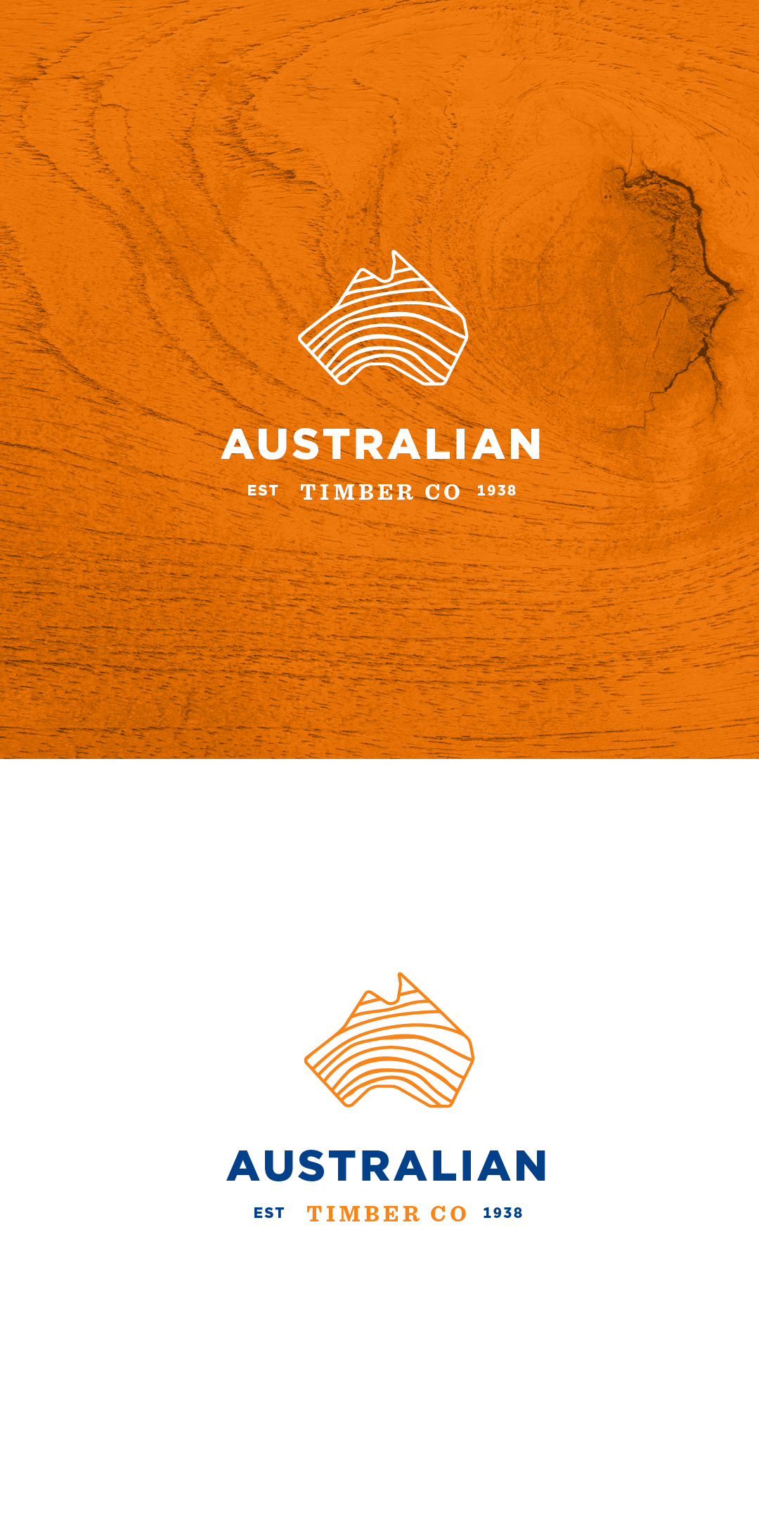
This is rebranding logo idea for Australian Timber Co. My idea was to strengthen product recognition, the timber itself. The blade of the previous design is implicitly visualized through the shape of the map of Australia. Conveys the meaning that their product comes from Australia and is cut with precision. I combined a sans serif typeface that gives a modern feel and a serif typeface to show that the company has been established for a long time.