Minimal logo for a coffee roastery

36
Created on 99designs by Vista
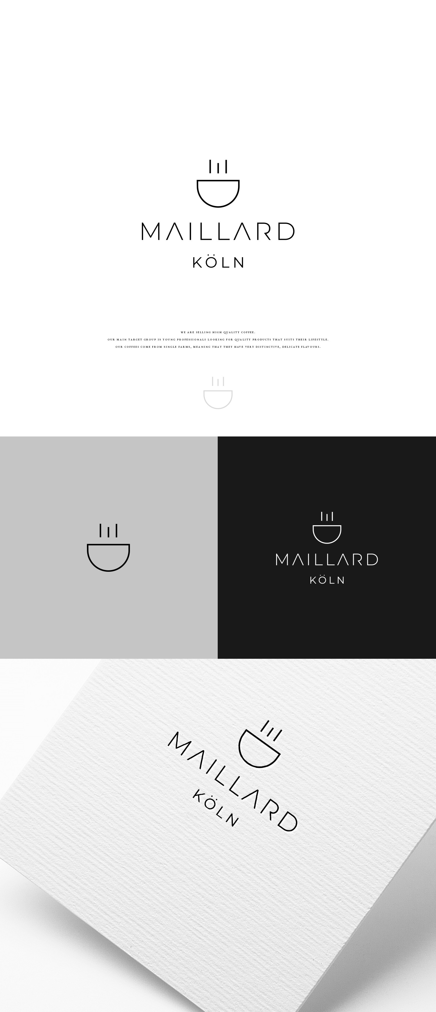
The client wants a minimal and simple logo icon. The symbol of a cup with 3 straight lines that symbolize aroma of the coffee, it also conveys a subtle representation of the letter "M" which the first letter of the brand name. The aim is to be simple and easy to recognize.